Testing Newsflash
2007-08-23: site updated to Newsflash 0.12 : the Helvetica selector is gone, which means some of the content of this post no longer applies.
 I've just given this blog a facelist using the Roople NewsFlash theme, and I'm somehow dubitative about it:
- on the plus side
- the 3 "user" blocks above content and the 3 other ones below content are a neat feature
- the color balance feels good to me, in either of the 3 predefined colors
- overall, it works way better than my "nested" theme a few months ago
- on the minus side
- although I tried various content layouts using the 3 user blocks, I couldn't get anything fit properly in them: it seems these will be specifically useful when a site has snippets of equivalent size to fill in them. This could probably be news (the theme isn't called Newsflash for nothing) or ads
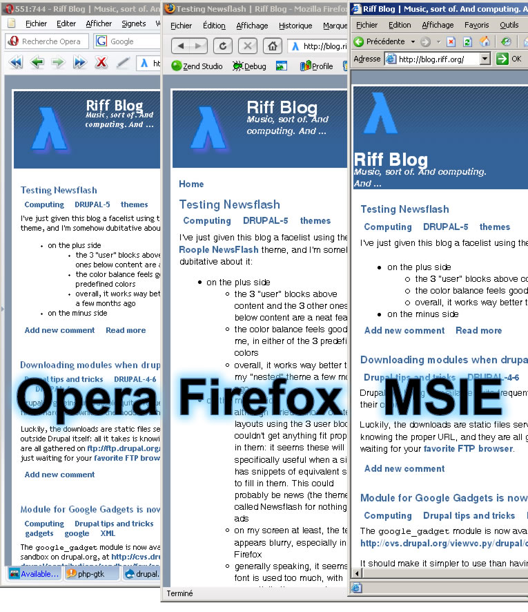
- on my screen at least, the text appears blurry, especially in Firefox
- generally speaking, it seems bold font is used too much, with essentially the same character sizes for title, tags, and various links. I think some more gradation in font effects would be welcome
- the site slogan is incorrectly positioned in MSIE
- in Opera and Firefox, the site slogan ascenders collides with the site name descenders
- the logo display code is wrong (relative URLs); I had to tweak it in
page.tpl.phpto accomodate the site folder structure - the logo setting doesn't apply properly
