2007-08-23: site updated to Newsflash 0.12 : the Helvetica selector is gone, which means some of the content of this post no longer applies.
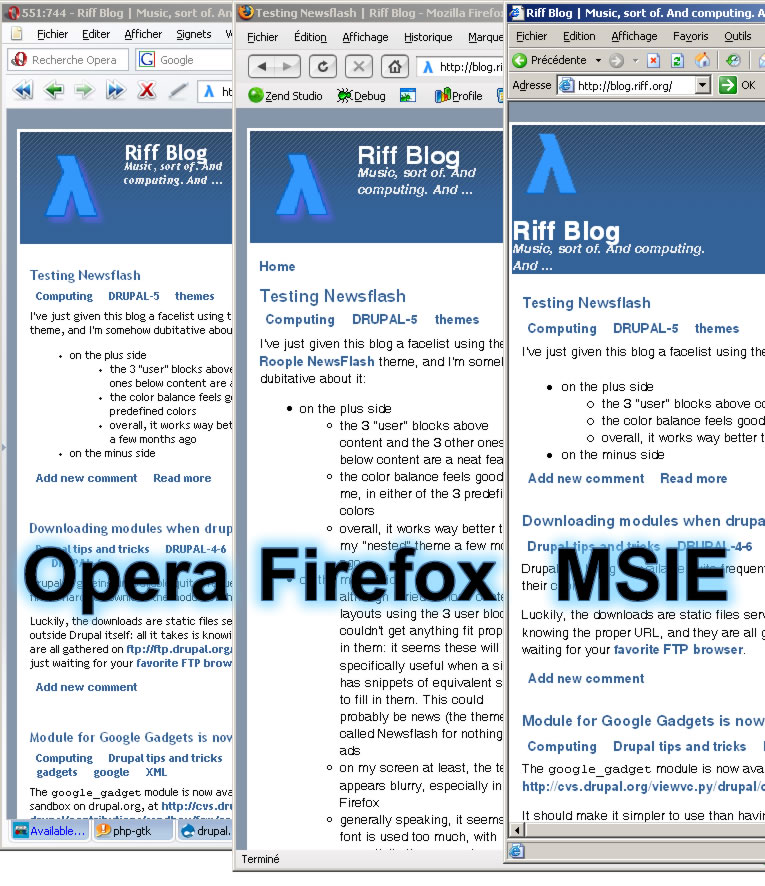 I've just given this blog a facelist using the Roople NewsFlash theme, and I'm somehow dubitative about it:
- on the plus side
- the 3 "user" blocks above content and the 3 other ones below content are a neat feature
- the color balance feels good to me, in either of the 3 predefined colors
- overall, it works way better than my "nested" theme a few months ago
- on the minus side
- although I tried various content layouts using the 3 user blocks, I couldn't get anything fit properly in them: it seems these will be specifically useful when a site has snippets of equivalent size to fill in them. This could probably be news (the theme isn't called Newsflash for nothing) or ads
- on my screen at least, the text appears blurry, especially in Firefox
- generally speaking, it seems bold font is used too much, with essentially the same character sizes for title, tags, and various links. I think some more gradation in font effects would be welcome
- the site slogan is incorrectly positioned in MSIE
- in Opera and Firefox, the site slogan ascenders collides with the site name descenders
- the logo display code is wrong (relative URLs); I had to tweak it in
page.tpl.phpto accomodate the site folder structure - the logo setting doesn't apply properly
- click on the image to see it full size
- in FF and MSIE, look at the "3" digits and compare them with their rendering in Opera
- in MSIE, look at the purple shadow around the lambda logo: it is missing
- in MSIE, look at the name and slogan positioning. It is not a question of window widthi
I think the text is somehow distorted
I think the text on your screen is somehow distorted. Are you using ClearType?
As for the theme, meh, it gets the job done.
No Cleartype
Actually no, I don't use ClearType, which I usually find more painful than useful. It is supposed to be useful on low-luminosity laptops LCD displays, I think, and the problem demonstrated in the screencap happens on both of my screens, one of which is a CRT and the other a high luminosity desktop TFT.
I agree that it , as you say (the 3+3 user boxes and their color matching). Just like Garland reloaded, I suppose. Actually, I like the concept in this Newsflash theme. I just have a problem with how to actually use it on a blog like this one, and a font issue. Hopefully, the rest of the issues are just standard bugs that will get fixed over time.
The fonts look fine to me
I'm viewing the theme in Firefox and the fonts look crisp. No different than any other rendered page.
I'd stay with this theme. The developers admit that these are still "Alpha" themes, so there's still a lot of formatting work to do. By using this theme, you can help them iron out the bugs. :-)
IMHO, your new drupal theme
IMHO, your new drupal theme is an improvment of your site.
But ...
Design is a question about taste. Things what I like, doesn't mean that other people will like.
And about how some theme (or some page design at all) looks different in different browsers? Well, that is curse of web designers
FF rendering
Thanks to all the answers. The rendering issues leave me perplexed, since all of the commenters seem not to have any display issue in FF, unlike me, for whom the only correct rendering on Windows/XP happens within Opera.
Checking further, I noticed that the FF rendering on Linux (screencap in this comment) doesn't have the same rendering problems as on Windows: the font smoothing/antialiasing seems better for FF there, whereas there is no significant difference for Opera betweeen the two platforms. Actually the title+mission rendering is even better with FF than with Opera.
It is starting to look like a simple matter of font substitutions. I wonder how Mac users see the compared versions ?
New theme
We like the new theme better!
Ok, so maybe we have a secret motive. But really, we think it looks great! We're not sure why you're seeing font issues with Firefox, but we're guessing that our font selector code needs some work. We'll look at in and try to find a solution.
Roople
Helvetica
I think I found the "problem". Using the respective DOM Inspectors of Opera and FF, I noticed the computed font attributes:
- Opera: font-family: Helvetica; font-size: 12px;
- FF: font-family: Helvetica; Verdana, Arial, Helvetica, sans-serif; font-size: 12.7333px;
The repeated Helvetica attribute probably comes from the shorthand selectorfont: 80% Helvetica, Verdana, Arial, Helvetica, sans-serif;on top ofstyle.css, but should not cause a problem. However, Helvetica is an old font, with limitations in its construction. Microsoft has an interesting page about TrueType hinting, which happens to use Helvetica to demonstrate some problems, so I just replaced that selector by: ...and the problem went away: with Verdana and Arial being first in the list, XP uses these and takes advantage of TrueType, while Linux, from which these are usually missing due to their licensing cost, will fall back to Helvetica, which will usually be present, or to another generic sans-serif font, thus seeing no difference. Mac users will probably notice a difference, since some of them will have Verdana and others won't.Theme Update
Helvetica gone
Yes, thanks. I updated, and noticed Helvetica is gone, which is just as well.
Two suggestions, though: